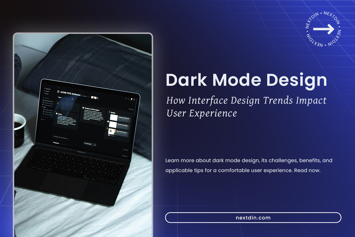
Dark Mode Design: The Impact of This Interface Design Trend
The popularity of the dark mode design continues to grow as more apps and operating systems offer dark display options. Dark mode is now a feature that is always available, whether you’re using social media or productivity apps or are on mobile or desktop devices. Many people prefer this look because it provides literal comfort for the eyes, especially in low-light or at night.
Besides the visual comfort factor, dark mode design can also present a modern, professional impression and increase focus. Many users feel the dark look reduces the device’s brightness and helps them concentrate better when using the application for a long time. This advantage makes the dark mode not only a sustainable trend but also a part of today’s interface design preference.
This article will discuss the overall dark mode design, starting with the reasons behind its popularity, its benefits and challenges from a user experience perspective, and tips on implementation and appropriate usage contexts in digital interface design.
Table of Contents
The Evolution of Dark Mode Design in Modern Applications
In its early days, dark mode was an optional feature designed to meet specific user needs. However, with increasing awareness of visual comfort and user experience (UX), dark mode has since become a design standard for many apps and websites. Today, UI/UX designers often consider dark mode design from the early stages of the process, not only as an additional feature.
Many popular applications on mobile and desktop devices consistently adopt dark mode. Social media platforms, design software, and productivity tools specifically offer dark mode to improve readability and visual comfort. This implementation shows how dark mode isn’t just switching from light to dark mode but is the result of a well-done design process.
Furthermore, dark mode has now become an important part of a brand experience. The dark color selection, contrast, and visual accent help build a brand identity that feels modern, exclusive, or professional. A consistent dark mode design can present an aligned visual experience with a brand’s character and value that it wants to offer to users.
Benefits of Dark Mode for Users
Dark mode isn’t only visually popular but also gives real benefits to users. Here are some of the benefits of appropriate dark mode implementation in digital products:
Eye Comfort in Low Light
Dark mode reduces screen brightness intensity, helping the eye to work less when used in low light. This makes reading, working, or browsing at night feel more comfortable. Thus, for users who frequently stare at screens for long periods of time, this benefit is very significant.
Better Visual Focus in Content
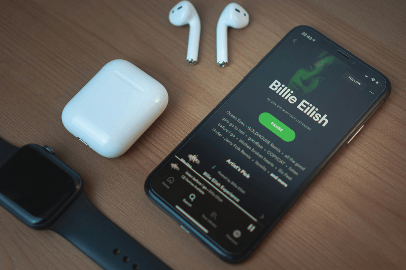
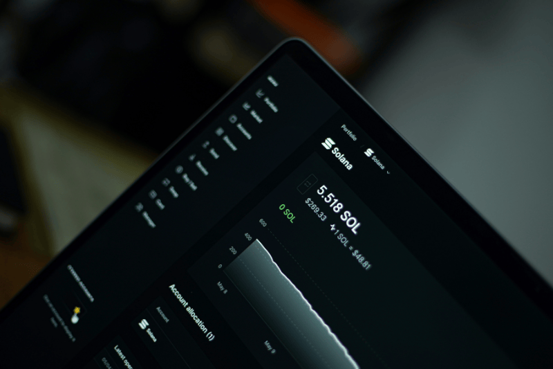
Dark backgrounds tend to emphasize the main elements, such as texts, images, and icons. With minimal visual distraction, users can focus more on the main content. Because of that, dark mode design is often implemented in productivity, entertainment, and digital platforms like social media.
Battery Usage Efficiency
In the device with OLED and AMOLED screens, dark mode helps improve battery usage. A dark pixel needs less energy than a light pixel. The more dominant the dark area on the screen, the less battery usage, making dark mode an ideal choice for mobile device users.
UX Challenges in Dark Mode Implementation

Despite its advantages, dark mode doesn’t always provide an ideal experience if implemented without careful planning. Here are some of the most common UX pitfalls associated with dark mode implementations.
Contrast and Readability Problem
The contrast imbalance between text and background can affect users’ comfort. In dark mode, the combination of black and light gray does have high contrast, making it easy to read in a short time. However, for long texts, the strong luminance difference can make the eye work harder, increasing the need for focus and potentially causing eyestrain.
Visual Distortion
Not all dark colors are suitable as the main background. The use of pitch-black color variations and shadows can reduce the visual hierarchy values. If the color transition isn’t executed precisely, the UI will look flat and confuse the users in choosing which one is the main element. The effective dark mode design needs a balanced color setting to make the UI element easy to recognize.
User Accessibility
Dark mode can be challenging for users with certain visual impairments, such as contrast sensitivity issues or astigmatism. The blooming effect on bright text and the sudden appearance of images or videos against a white background can create extreme light differences and lead to eye strain. Therefore, accessibility needs to be considered while designing dark mode.
Tips for Designing Comfortable Dark Mode
To ensure dark mode increases the user’s experience, the implementation needs to be designed strategically and not merely switch the color scheme from light to dark. The understanding of UI Design Principles helps create a more comfortable, structured dark mode design that maintains the readability and visual hierarchy. Here are several tips that can be implemented in designing dark mode effectively.
Use Softer Dark Colors
Avoid the use of pure black (#000000) as the main background because its high contrast can strain the eye. As an alternative, use softer dark colors, such as grey or dark blue, to maintain the contrast clarity while not being too sharp. This approach helps create a more comfortable, natural, and friendly look for long-term users.
Strengthen Visual Hierarchy and Typography
Visual hierarchy is crucial in dark mode. The difference in text size, font thickness, and brightness color level needs to be arranged consistently to make the structure of the information easy to understand. Therefore, appropriate typography ensures the text remains readable on a dark background.
Maintain Consistency between Light and Dark Mode
Dark mode shouldn’t drastically alter the interface structure. Consistent element positioning, icons, and interaction patterns help users adapt quickly when switching between modes. This consistency ensures the user experience remains familiar across both displays.
The Best Way to Use Dark Mode
Despite the advantages, dark mode does not always become the best choice in all situations. The display look should be adjusted with the app contexts and users’ needs. Here are several considerations in determining the appropriate way of implementing dark mode design.
Application Types Suitable for Dark Mode
Dark mode is ideal for applications used for extended periods, such as social media, entertainment platforms, coding, and professional dashboards. The dark appearance helps reduce eye fatigue and improve user focus.
The Effective Situation for Dark Mode
Dark mode should be designed based on the time and environment in which the app is used. It will be more comfortable and optimal if you use an app primarily at night or indoors. On the other hand, for apps primarily used outdoors during the day, dark mode is less effective because visibility can decrease under bright lights.
Dark Mode to Build a Specific Brand Impression
Dark mode is effective when a brand wants to emphasize luxury, exclusivity, modernity, or premium impressions. In this context, branding strategy and visual psychology are the basic principles for deciding to use dark mode, ensuring its appearance reinforces the product’s identity and character.
Conclusion: The Importance of Dark Mode Design in Modern UX
In addition to being a visual trend, dark mode is an essential component of user experience design that requires careful UX considerations. Dark mode design gives benefits like eye comfort, visual focus, and energy efficiency that can significantly improve the user interactions.
However, we shouldn’t overlook the challenges related to contrast, readability, and accessibility. Color selection, visual hierarchy, and interface consistency are key factors in creating an effective dark mode. By providing the dark mode design as one of the display mode choices, designers can create inclusive, flexible, and relevant design solutions for various usage scenarios.