
Design System: A Foundation for Digital Product Scalability
In the midst of rapid digital product development, design consistency becomes crucial for ensuring user experience quality. A design system is a strategic approach that ensures the balance of visuals, interaction patterns, and design standards across multiple platforms. Without a structured system, the distinction between style and component will become apparent, especially as the team grows and the product’s complexity increases.
For a team of designers, developers, and product managers, consistency is not merely about appearance but also about work efficiency. With a well-documented guide and component, the development process will be quicker, more directed, and have minimal errors. This system makes it possible for all the members of a team to work using the same reference, resulting in a more effective collaboration.
This article discusses the definition of a design system, its main components, and its benefits for product teams, as well as examples of its implementation in the technology industry.
Table of Contents
What is a Design System?
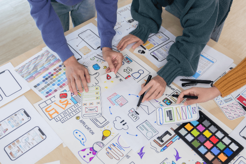
In the context of UI/UX, a design system is a collection of standards, principles, and design components that are structurally documented to build and manage the digital product. This system encompasses visual elements, such as colors, typography, grid layouts, icon packs, and interface components like buttons, forms, and navigation.
More than just an asset collection, this approach functions as the framework that ensures consistent UX in various features and platforms. Additionally, this system becomes the bridge between the design teams and the development teams. With clear documentation and reusable components, the development process will be more efficient and measured.
It is important to understand that a design system is different from a style guide or UI kit. A style guide usually only contains visual guidelines, while a UI kit includes ready-to-use components. This concept, on the other hand, encompasses both, along with design principles, usage rules, technical documentation, and implementation guidelines to support long-term scalability.
The Main Components of a Design System
A design system is made up of several interconnected elements that ensure uniformity and efficiency during the design process. These core components interconnect to ensure the overall consistency of a product.
Design Principles and Brand Guidelines
Design principles become a core foundation since they direct each decision-making process for a design. If you want to learn more about how to use these concepts in an interface setting, you may read an article about UI design principles. These principles should be compatible with the brand guidelines so that all visual elements and interactions in UI/UX designs represent the brand identity.
Style Guides
Style guides are a collection of visual standards used to maintain design consistency in a digital product. The guide encompasses basic elements like typography, color system, and button style, as well as grid and spacing system. With this standard, each look in a product can feel more consistent, structured, and understandable for the users.
Component Library
A component library is a collection of interface elements that are reusable in a design process and digital product development. The existence of a component library helps speed up the workflow as well as ensure design consistency throughout the product.
Some examples of components in a component library are buttons, form fields, navigation bars, cards, and structural elements like headers and footers.
Design Tokens
Design tokens are the smallest unit in a design system that represents atomic design value, including colors, typography, and spacing in variable data that is agnostic (not chained to any platform). By giving the technical value a semantic identity, such as converting HEX codes to “color-primary,” tokens create a “universal language” that bridges the gap between designers and developers. If the “color-primary” changes, designers and developers will only need to change one token, and the whole system will update automatically.
Documentation and User Guide
Documentation becomes the center of reference that explains the rules, variations, and the component implementation example. A clear guide makes it easy for collaboration across teams and maintains the consistency of the applied system.
The Benefits of a Design System for Product Team

The implementation of a structured design system has real impacts on the digital product development process. The following are some main benefits that can be felt by the team:
UX Consistency
With a clearly defined standard, a design system can maintain a balance between appearance and interactivity in a product. This consistency increases trust and makes it easier for users to comprehend the system’s workflow without having to readjust for each feature. Uniform design patterns and interactions enable users to interact faster and more comfortably, as the experience feels familiar and intuitive.
Efficiency of Design Process and Development
Components that can be reused can quicken the workflow and reduce work duplication. The team does not need to design or develop the same elements repeatedly because all of them are documented and standardized. A more efficient process minimizes production time, allowing the team to concentrate on developing strategic features and product innovation.
Effective Collaboration across Teams
A design system becomes a common language for designers, developers, and product managers. The same standards minimize miscommunication because each party refers to uniform guidelines and components. This helps the processes of discussion, planning, and implementation to run more structurally and coordinated.
Long-Term Product Scalability
Along with product growth, a framework ensures development remains consistent and directed. Adding new features can be done without sacrificing identity and the quality of a design. With a strong foundation, your product will be ready to develop following the business demands and market dynamics.
The Implementation of Popular Design System
To understand how its application works in reality, several major technology companies have developed integrated design systems that have become global references. Here are some popular examples that are widely used and studied:
Material Design (Google)
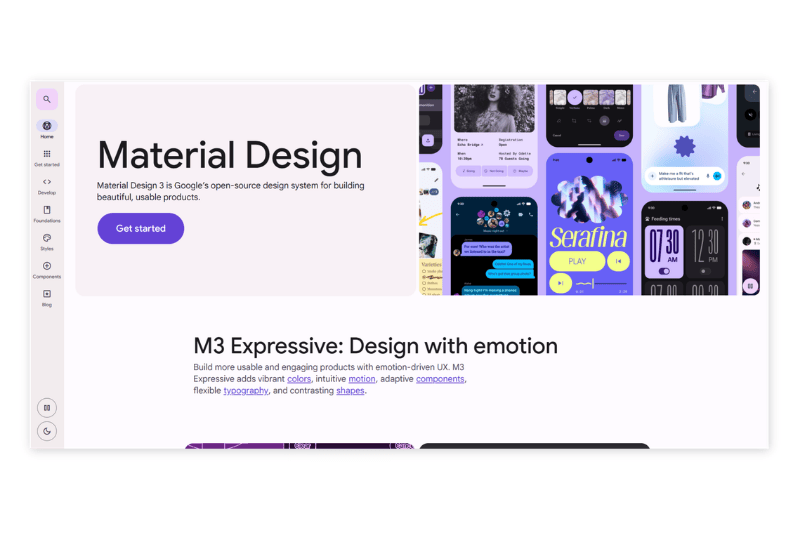
Google created Material Design as a design guide that focuses on the principles of clean visuals, clear hierarchy, and responsive animation. This system includes UI components and guides for font, color, and interaction patterns that are uniform across platforms. Material Design enables developers and designers to build a consistent UX across the Google product ecosystem.
Human Interface Guidelines (Apple)
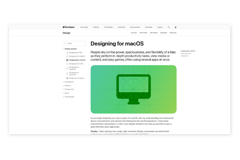
The Human Interface Guidelines (HIG) from Apple focus on simplicity, clarity, and depth of user experience. This guide is designed to ensure that the interface in iOS, macOS, and other Apple platforms feels more intuitive and harmonious with the brand character. HIG emphasizes the importance of visual consistency and natural interaction with the users.
Carbon Design System (IBM)
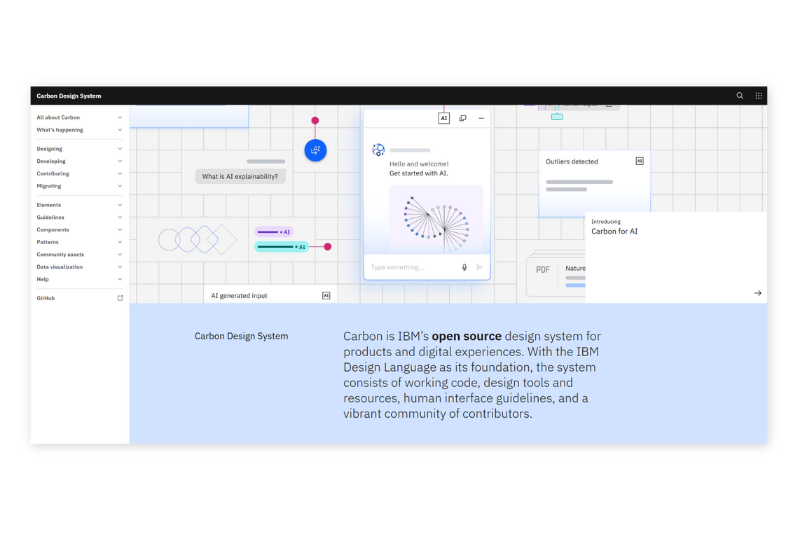
The Carbon Design System is a system developed by IBM to support enterprise-scaled digital products. This system provides standardized components, strong accessibility, and complete technical documentation. Carbons help big teams maintain design consistency in a complex production environment.
Ant Design
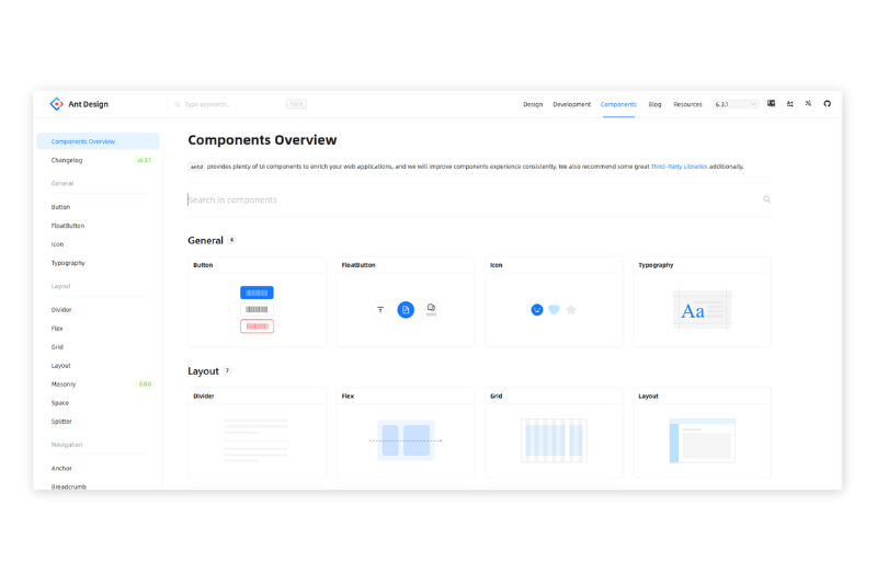
Ant Design is a design system often used by web-based application developers, especially for the enterprise products. This system provides structured and ready-to-use UI components complete with detailed documentation. Ant Design is popular due to its practical and efficient approach in building a complex yet consistent interface.
Conclusion: The Role of a Strategic Design System in Digital Products
A design system is not just a collection of visual components. It is a strategic foundation in building consistent, efficient, and sustainable digital products. With a structured system, a team can work in a directed manner, speed up the development process, and maintain UX quality.
Lastly, investing in this systematic approach helps organizations reduce inconsistencies, improve collaboration, and prepare products to develop more. This approach becomes a crucial step in creating a competitive digital experience, especially in this transformational technology era.